


Carin Jora卡琳乔拉和融润的联手,在2700平米的建筑空间中延续奢侈品“艺术馆”为设计原点和视觉表达,通过产品自身的特性,在空间上融入当代文化的艺术,让光影,色彩,功能等成为展厅的设计主题。
Carin Jora and Ronrun have joined forces to continue the luxury "art gallery" as the design origin and visual expression in the 2,700-square-meter building space. Through the characteristics of the product itself, it integrates the art of contemporary culture in the space, allowing light and shadow, Color, function, etc. become the design theme of the exhibition hall.
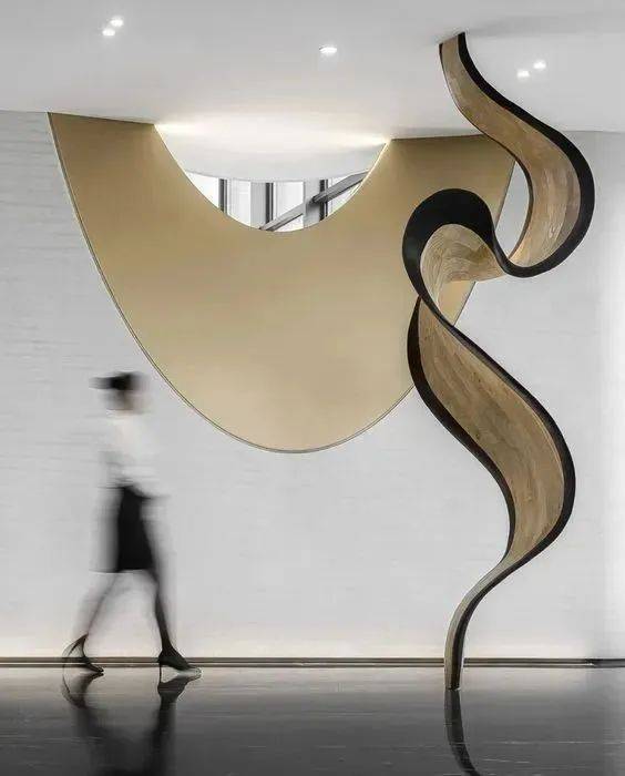
设计的开端,始于要通过空间来表达一家公司的视野。作为公司展厅兼办公空间,项目设计的难度在于如何展示,当人走进这个空间感受到什么,通过每个空间不同的设计旋律,创造多种可能的体验。Carin Jora卡琳乔拉专注品质、苛求细节在本次总部展厅的设计合作上选择与国际多个顶级品牌指定合作商的融润来进行整体呈现。
The beginning of design begins with expressing a company's vision through space. As a company exhibition hall and office space, the difficulty of project design lies in how to display, what people feel when they walk into this space, and create a variety of possible experiences through the different design melodies of each space. Carin Jora focused on quality and demanded details. In the design cooperation of the exhibition hall of the headquarters, she chose Ronrun, a designated partner of many top international brands, for the overall presentation.
融润超级定制 X
Carin Jora卡琳乔拉
项目名称:Carin Jora卡琳乔拉展厅办公室项目
项目内容:卡琳乔拉展厅设计、办公室设计、室内设计
项目面积:2700平米
项目地点:广州·花都
项目时间:2022年
设计方:融润设计
Project Name: Carin Jora Showroom Office Project
Project content: Carin Jora showroom design, office design, interior design
Project area: 2700 square meters
Project location: Guangzhou·Huadu
Project time: 2022
Designer: Ronrun Design
△项目平面图
本次项目融润设计团队主要围绕Carin Jora卡琳乔拉独特的风格故事 —— 以“简约不等于简单”的设计语言与精致的元素共存于同一空间中,既链向一种更普适于现代审美的风格性格,也回应着Carin Jora卡琳乔拉的品牌内核质感。
The Ronrun design team of this project mainly revolves around the unique style story of Carin Jora—the design language of "simplicity does not mean simplicity" coexists with exquisite elements in the same space, which not only links to a more common modern style The aesthetic style character also responds to the core texture of the brand of Carin Jora.
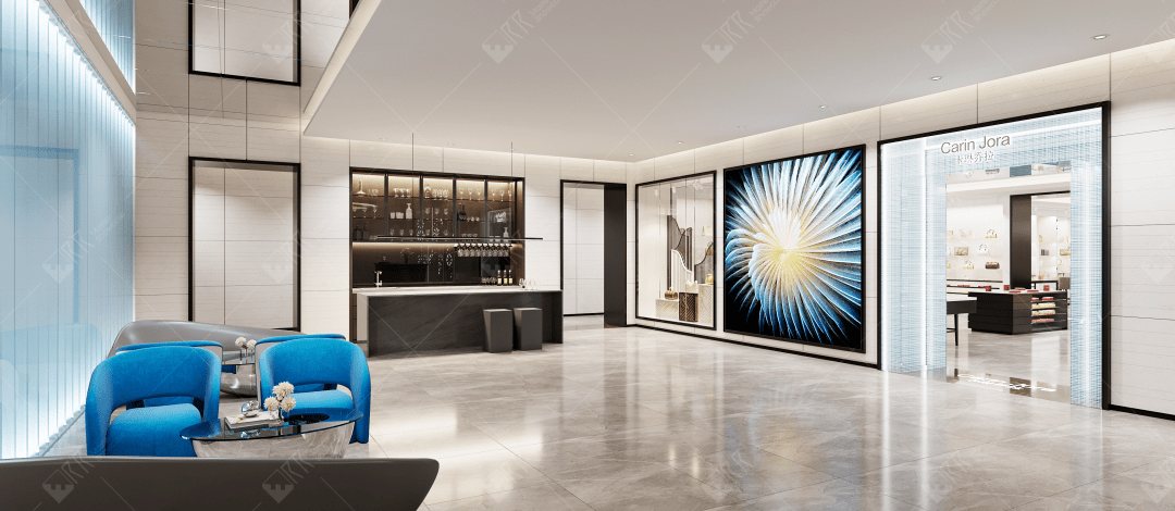
△设计效果图
品牌前厅
Brand Front Office
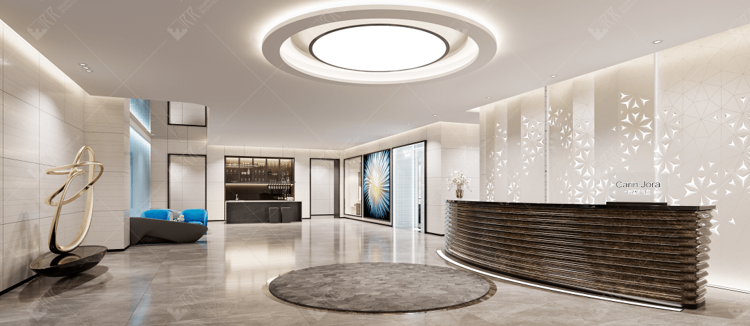
△设计效果图
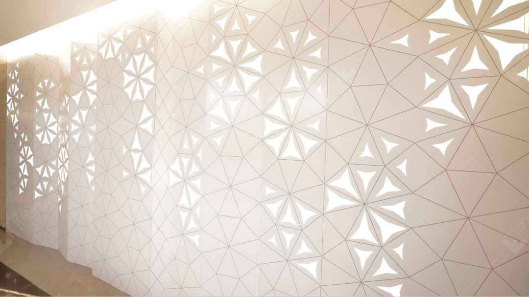
△现场实拍
对空间和产品的体验接触,从展厅前台区域即开始;利用展厅入场区域,我们打造出一个简洁大气又有设计特色的接待区域。深灰色系岩板结构的前台,背景墙以镂空花瓣透出的光共同营造出一份雅致且简洁、柔和且利落的空间区域,大圆形的吊灯装饰呼应着Carin Jora卡琳乔拉的品牌调性。
Experience contact with space and products starts from the front desk area of the exhibition hall. Using the entrance area of the exhibition hall, we created a simple and elegant reception area. The front desk with dark gray rock slab structure and the background wall create an elegant, simple, soft and neat space area with the light from the hollow petals on the background wall. The large round chandelier decoration echoes the brand tone of Carin Jora sex.
展厅外立面
Outer facade
△现场实拍
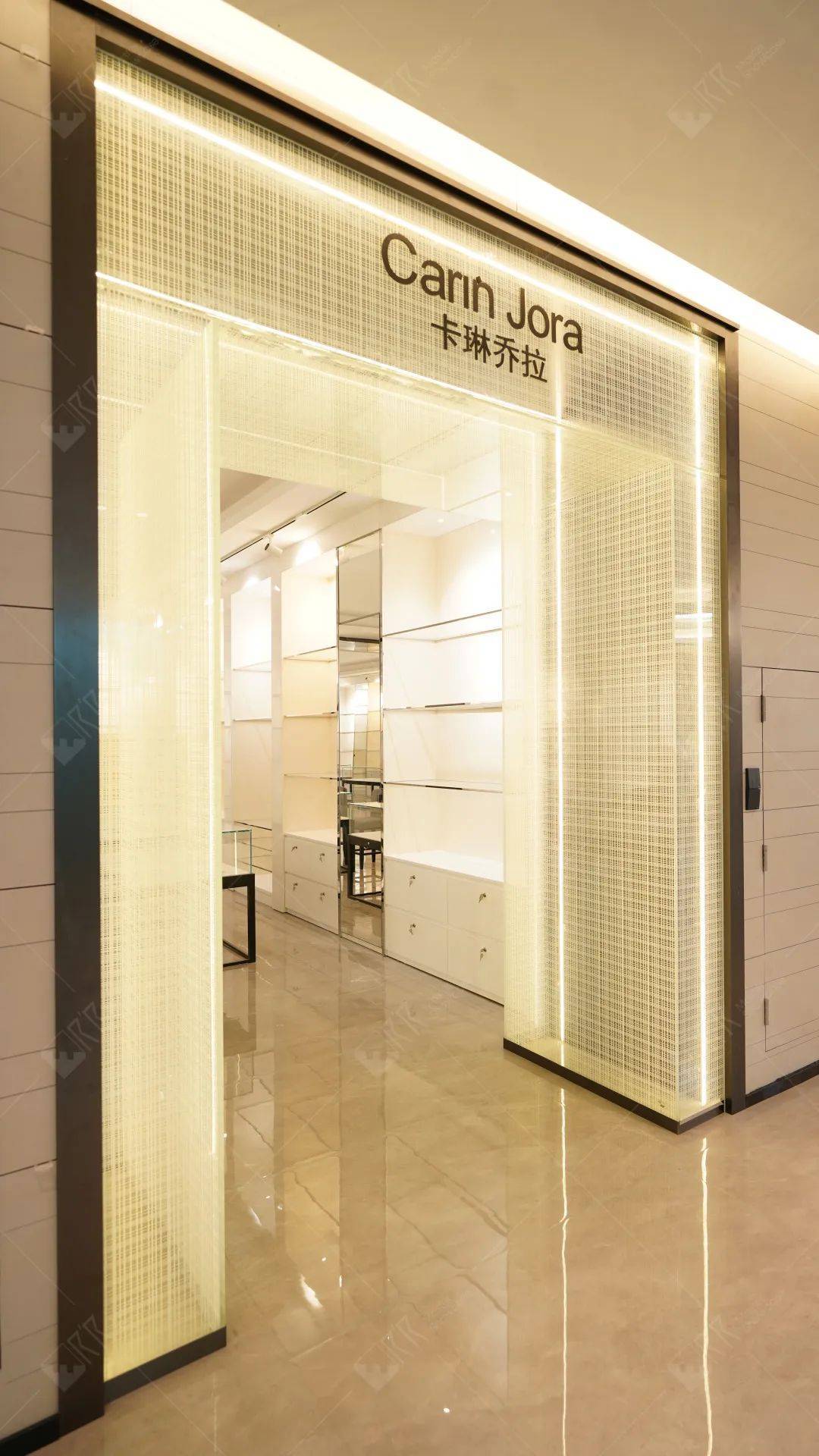
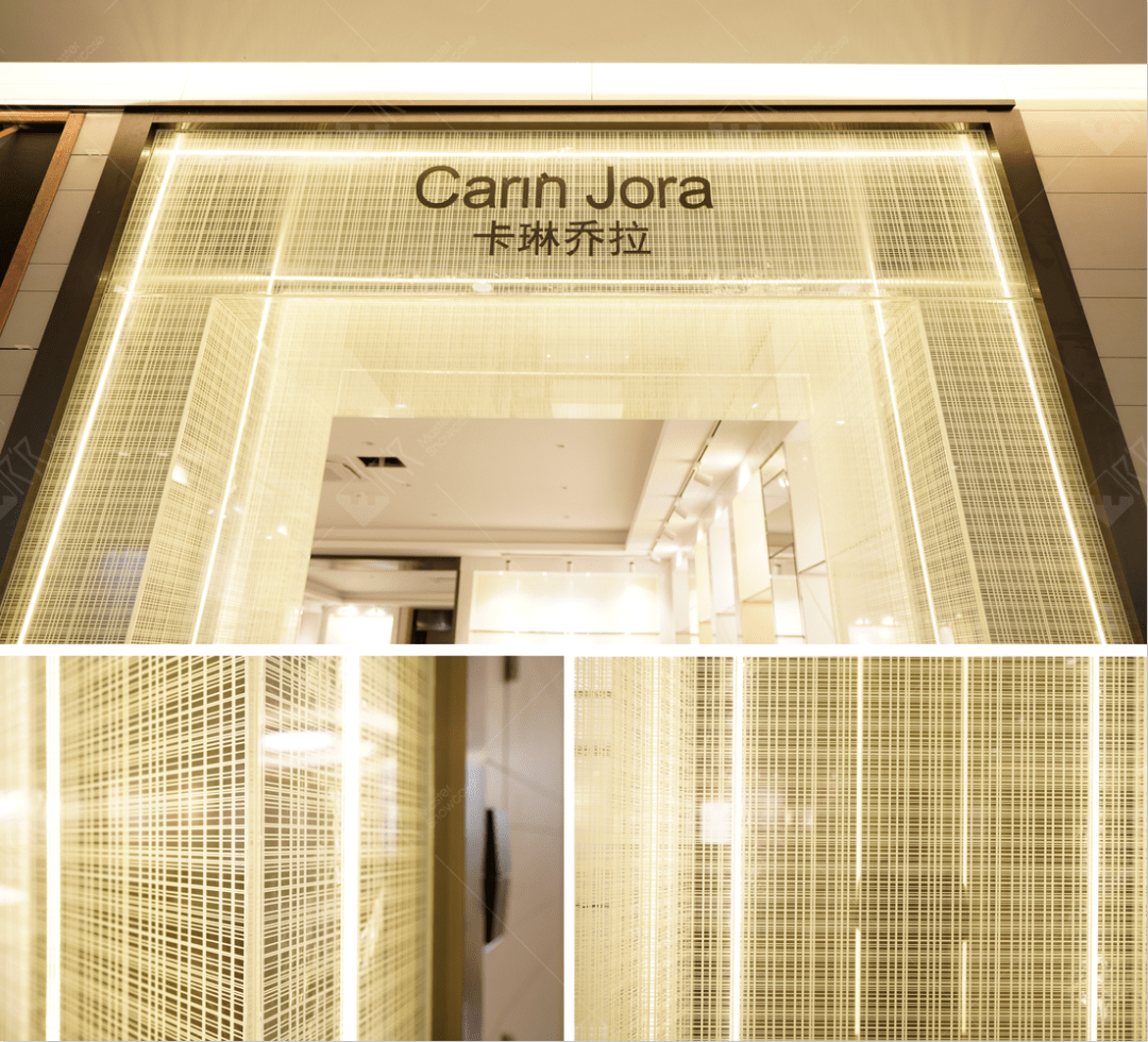
展厅外立面以横纵细纹形成的简洁几何阵列图形与夹丝玻璃等特殊工艺融入外立面;门框采用玫瑰金属的材质,简单的线条构成华丽的图形,玫瑰金属与夹丝玻璃工艺,在灯光的加持下营造出聚焦而丰富的视觉层次。
The facade of the exhibition hall is integrated into the facade with a simple geometric array pattern formed by horizontal and vertical fine lines and special techniques such as wired glass; the door frame is made of rose metal, and the simple lines form a gorgeous figure. Rose metal and wired glass technology, With the blessing of lighting, a focused and rich visual hierarchy is created.
△现场实拍
Carin Jora卡琳乔拉标识以中英文组合的形式出现在门头顶部,作为品牌特定视觉符号而存在。整体上更为轻盈与通透,进一步弱化了内外空间的边界感。
The Carin Jora logo appears on the top of the door in the form of a combination of Chinese and English, and exists as a brand-specific visual symbol. On the whole, it is lighter and more transparent, further weakening the sense of boundary between internal and external spaces.
展厅空间
Showroom space
△设计效果图
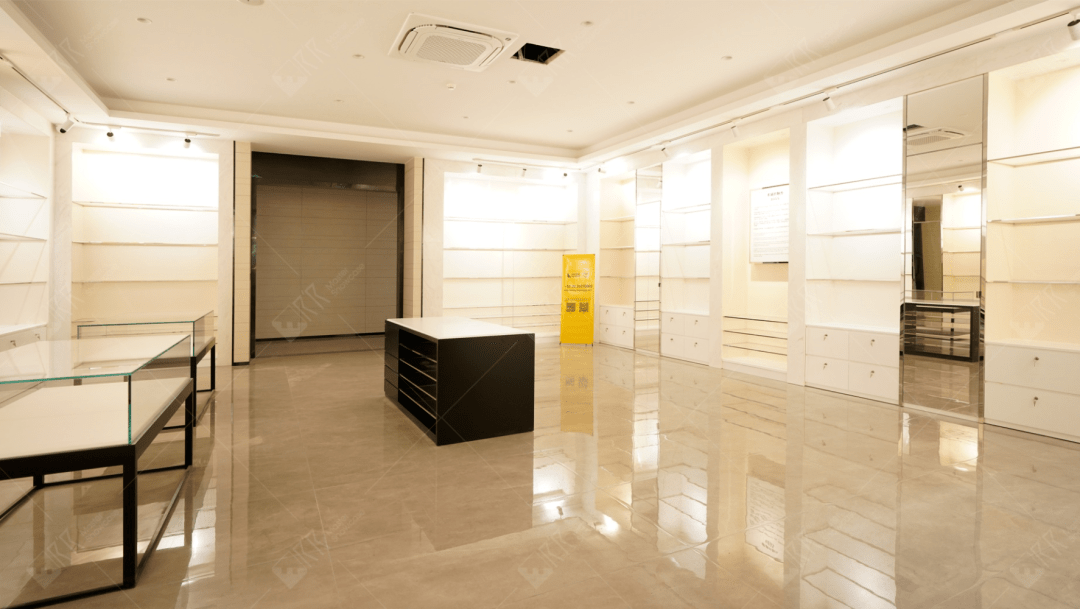
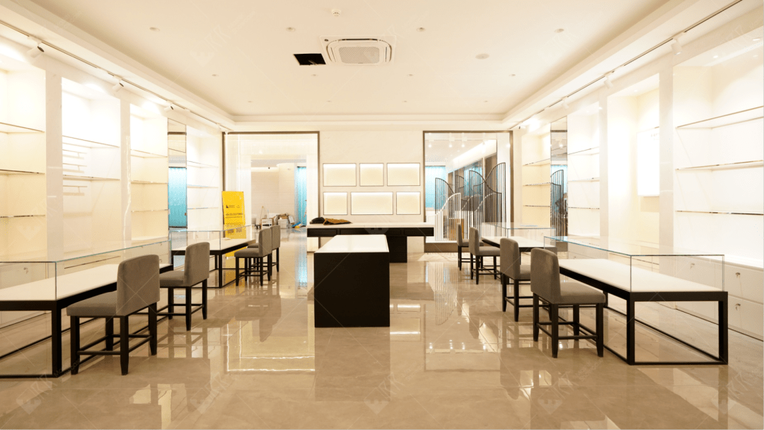
展厅空间设计采用高贵典雅的米白色作为主色调,同时在软装上采用品牌棕色和高级黑做点缀,提取品牌内在属性的色彩与材质,让空间的视觉基调有了合宜而富有韵律的载体,使空间回归品牌本源。
The space design of the exhibition hall adopts noble and elegant off-white as the main color, and at the same time, the soft decoration is embellished with brand brown and high-grade black to extract the color and material of the brand's intrinsic attributes, so that the visual tone of the space has an appropriate and rhythmic carrier. Bring the space back to the origin of the brand.
△现场实拍
展厅里面植入更具体的展柜工艺工法体系及品牌实力展示,让整体空间更具专业感和区域属性;展柜以独特的材质质感和艺术品味,由外到内不断深入,调动情绪,从而更好地欣赏商品,传递生动的感知。
In the exhibition hall, a more specific showcase technology system and brand strength display are implanted to make the overall space more professional and regional; With unique material texture and artistic taste, the showcase goes deeper from the outside to the inside to mobilize emotions, so as to better appreciate the products and convey vivid perceptions.
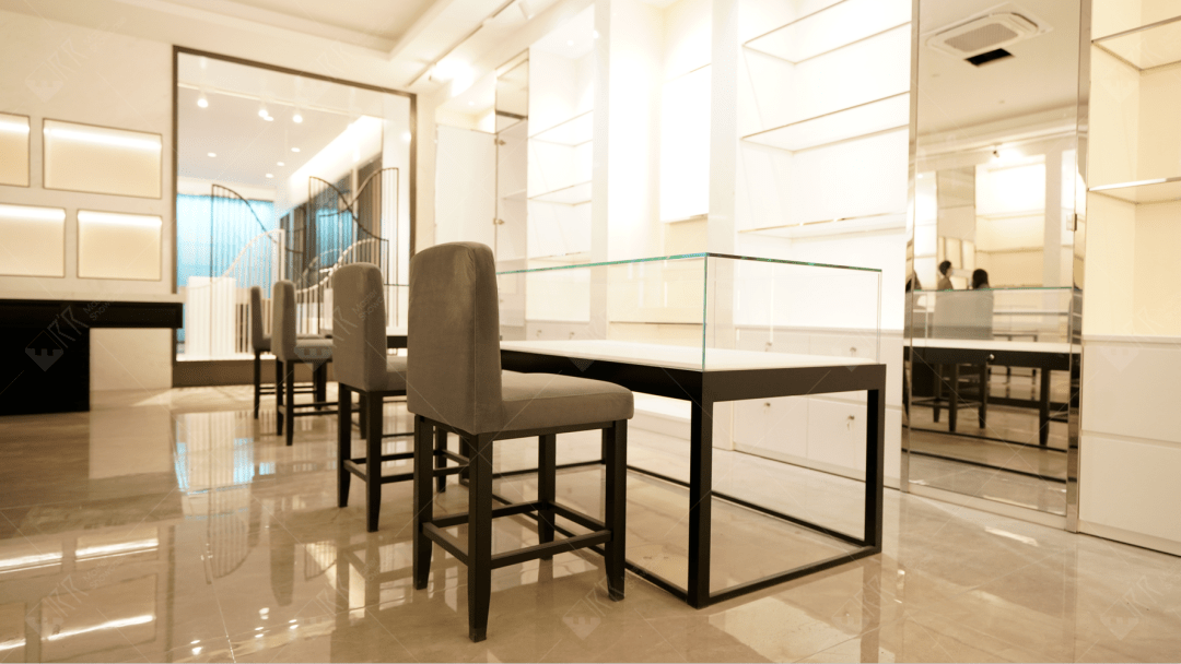
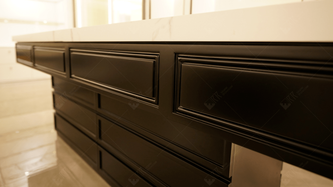
△现场实拍
展厅陈列的每一个展柜,摆放的每一张椅子,每一个细节都极致考究,充满了美学和艺术的同时,让顾客的需求都能够被设计用心地呵护到。更趋整洁及阵列式的产品展示,优化着客户的选购体验。
Every showcase displayed in the exhibition hall, every chair placed, and every detail are extremely exquisite, full of aesthetics and art, and at the same time, the needs of customers can be carefully cared for by the design. The more tidy and arrayed product display optimizes the customer's shopping experience.
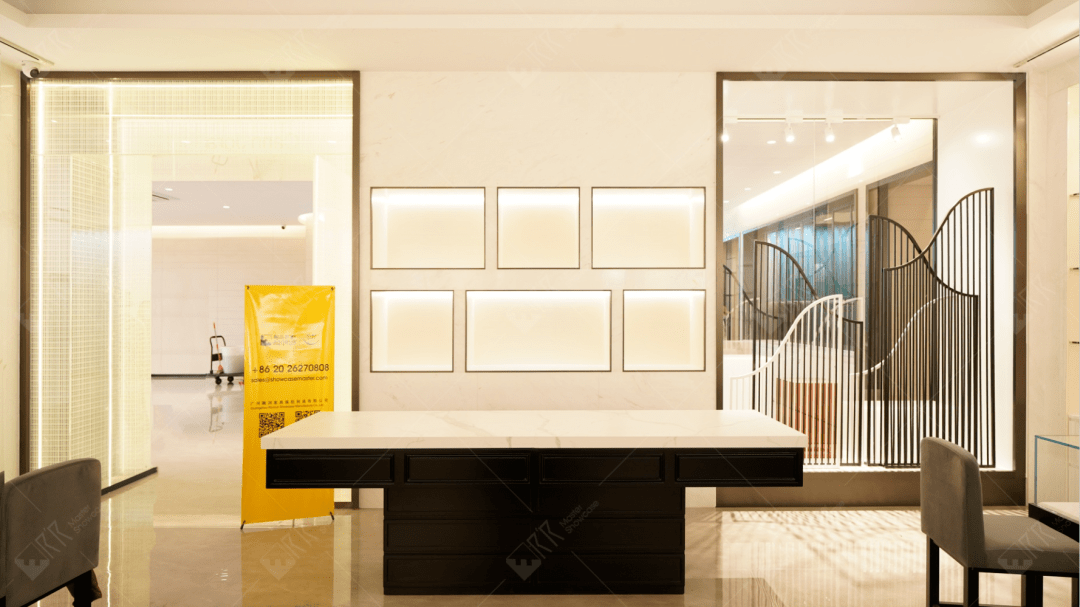
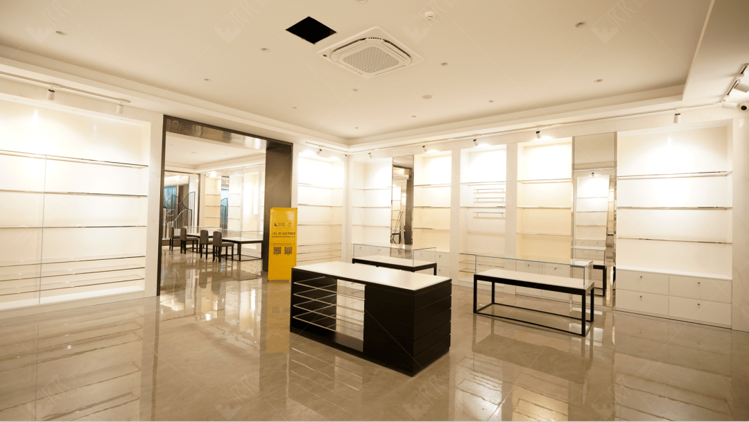
△现场实拍
“颜值”与“感性”之外,连接消费者对于购买选购的功能需求 ,在消费者逛店进程中明确传递出奢侈品的核心价值的感知。
In addition to "appearance" and "sensibility", it connects consumers' functional needs for purchasing and purchasing, and clearly conveys the perception of the core value of luxury goods in the process of shopping for consumers.
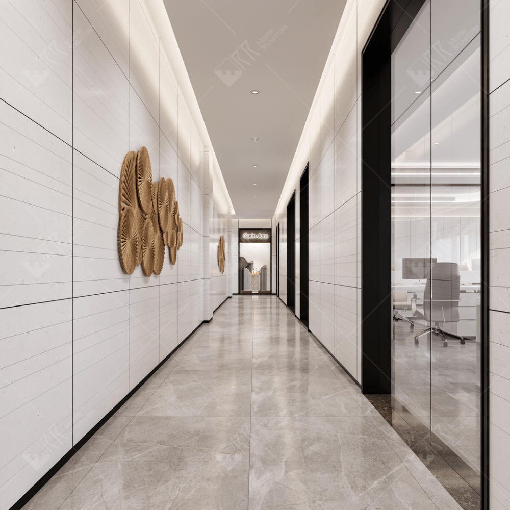
△设计效果图
△现场实拍
通往其他区域的走道巧妙置入橱窗景观,让整个空间的展陈氛围不失柔和、自然属性;简约格栅,通过空间陈列设计,承载着产品的故事与细腻的人文关怀。
The aisles leading to other areas are subtly placed in the window view, so that the display atmosphere of the whole space is soft and natural;The simple grille, through the space display design, carries the story of the product and delicate humanistic care.
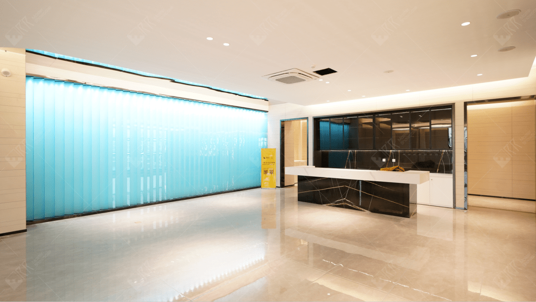
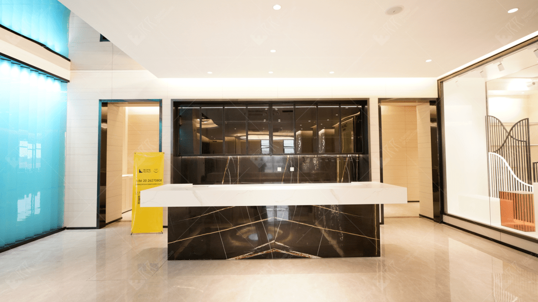
△现场实拍
我们深信,品牌与产品最本质内核的价值,有着持续新生的力量。客户的体验,产品与场景缺一不可,本项目的空间设计即围绕奢侈品“艺术馆”而展开。简约而不简单的设计语言,满足消费者审美的“奢侈品”消费场景,无论是空间中的产品场景或者功能区域,都能感知到被精心雕琢的设计美感。
We firmly believe that the most essential core value of brands and products has the power of continuous regeneration. Customer experience, products and scenes are indispensable. The space design of this project revolves around the luxury "art gallery". The simple but not simple design language meets the "luxury" consumption scene of consumers' aesthetics. Whether it is a product scene or a functional area in the space, you can feel the beauty of the design that has been carefully crafted.
注:以上为展厅空间分享,其他空间敬请期待!


